As a member of the Marketing and Communication team at Frontiers, an open-access publisher, I was responsible for rebranding and illustration exploration.
As an impact designer, I focused on designing key visuals, brand exploration, template standardization, and illustrations for the Frontiers brand and its sub-brand Frontiers Journals.
Year: 2021
Client: Frontiers
Role: Graphic Designer, Illustrator
Client: Frontiers
Role: Graphic Designer, Illustrator
Rebranding and illustration exploration
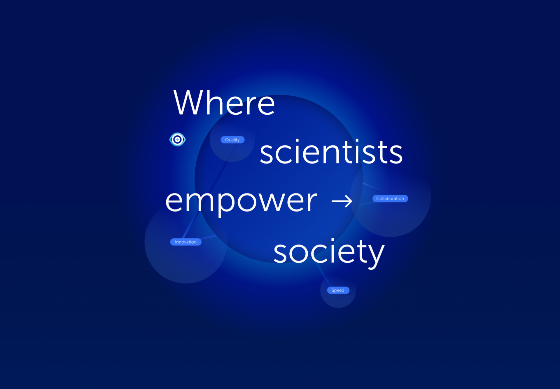
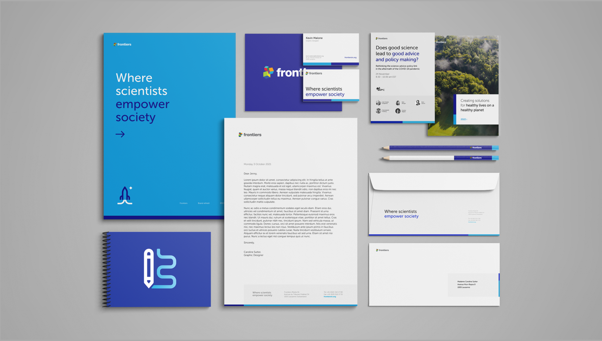
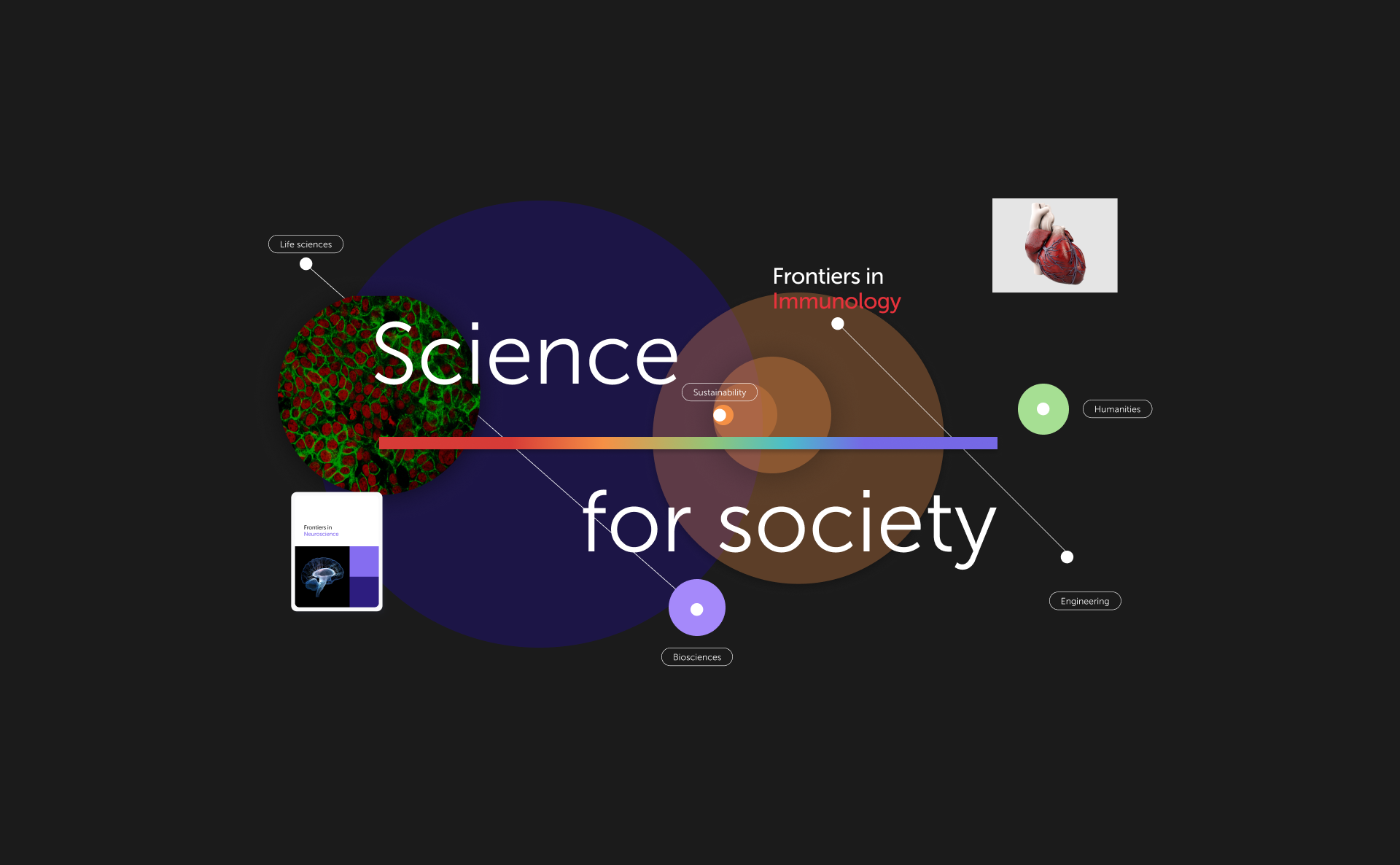
While exploring visuals for Frontiers, I faced the dual challenge of creating corporate branding for Frontiers as a company and a separate branding for Frontiers Journals. It was crucial to differentiate these two aspects while maintaining a unified look.
To emphasize the main hierarchy, I utilized Frontiers' primary colors and subtle gradients, prioritizing elements such as images, data visualizations, and fonts. The main hierarchy was defined by focusing primarily on one key element. For the graphical aspect, I used circular elements with lined vectors as key visuals. For Frontiers Journals, I kept the same base as Frontiers' main brand but introduced different colors to highlight the diversity and quantity of the journals.
To emphasize the main hierarchy, I utilized Frontiers' primary colors and subtle gradients, prioritizing elements such as images, data visualizations, and fonts. The main hierarchy was defined by focusing primarily on one key element. For the graphical aspect, I used circular elements with lined vectors as key visuals. For Frontiers Journals, I kept the same base as Frontiers' main brand but introduced different colors to highlight the diversity and quantity of the journals.

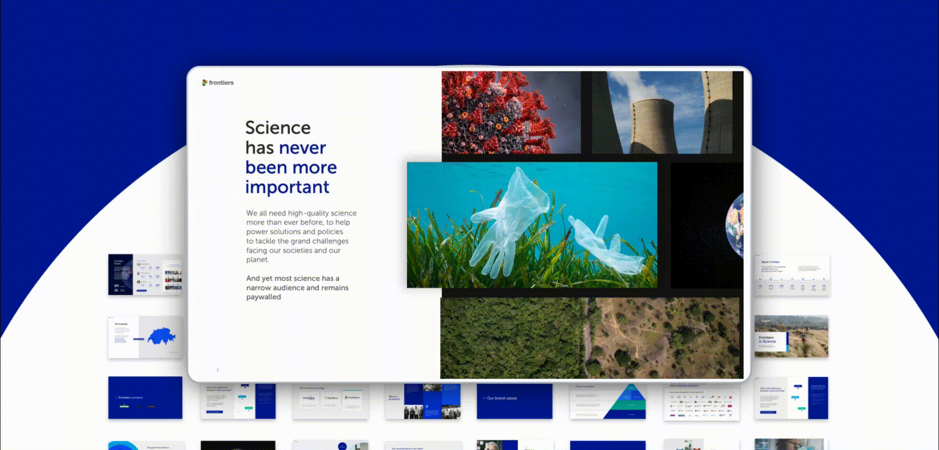
Presentation and animations
One of my main tasks as a design team member was designing presentations and graphs. The presenters varied (scientists, stakeholders, executive leaders, team members), as did the events where these presentations were held (Forums, Conventions, Annual Report presentations, Internal Team Presentations, All Hands Meetings, etc.)
Some were technical and science-based, while others required eye-catching and impactful designs to engage the audience. This allowed me to develop a deep exploration into infographics and data visualization. Once the presenters approved the content and layout I would produce the final animations.
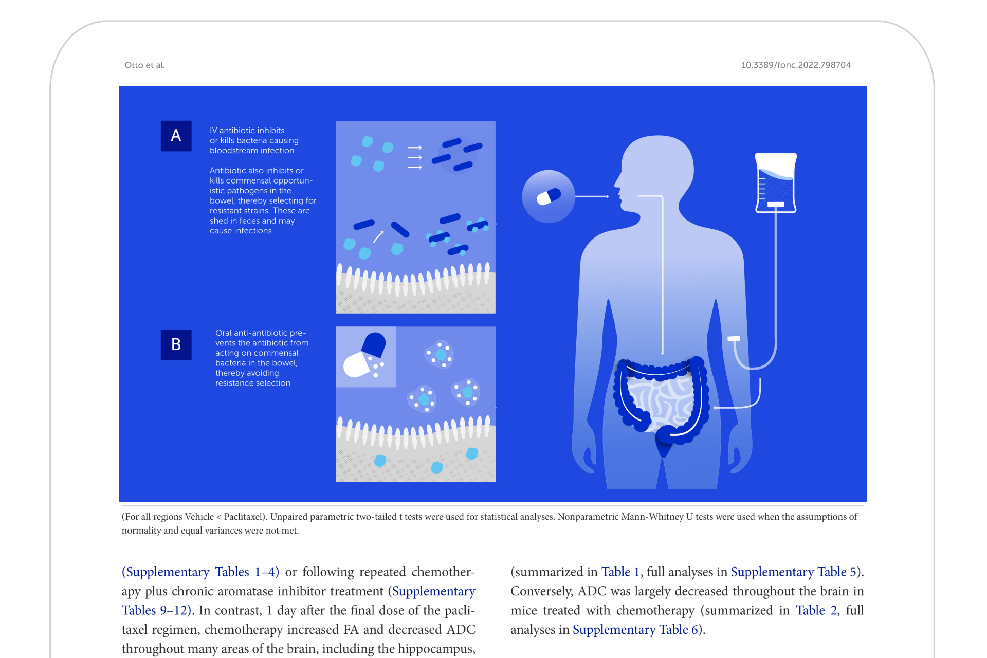
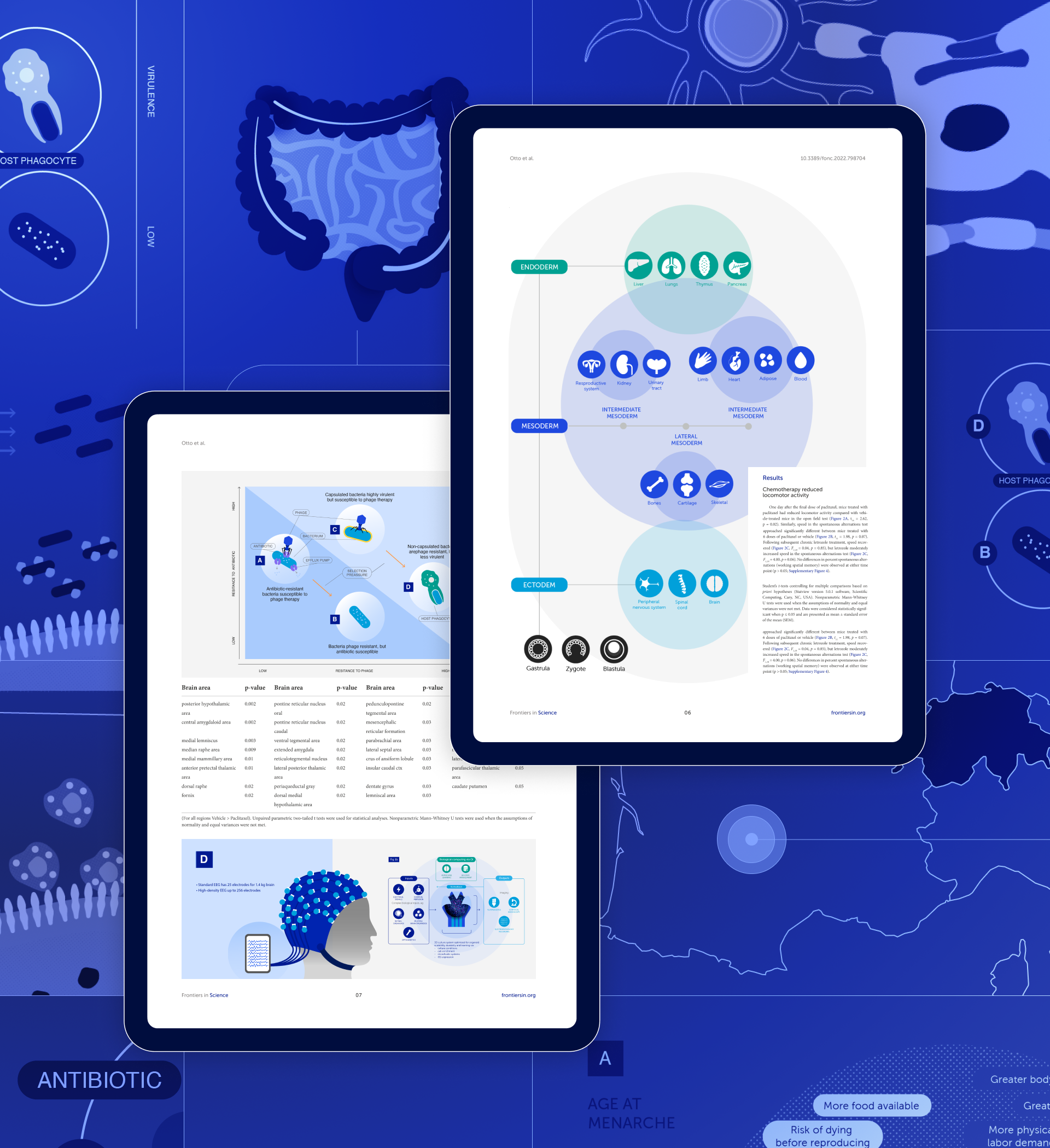
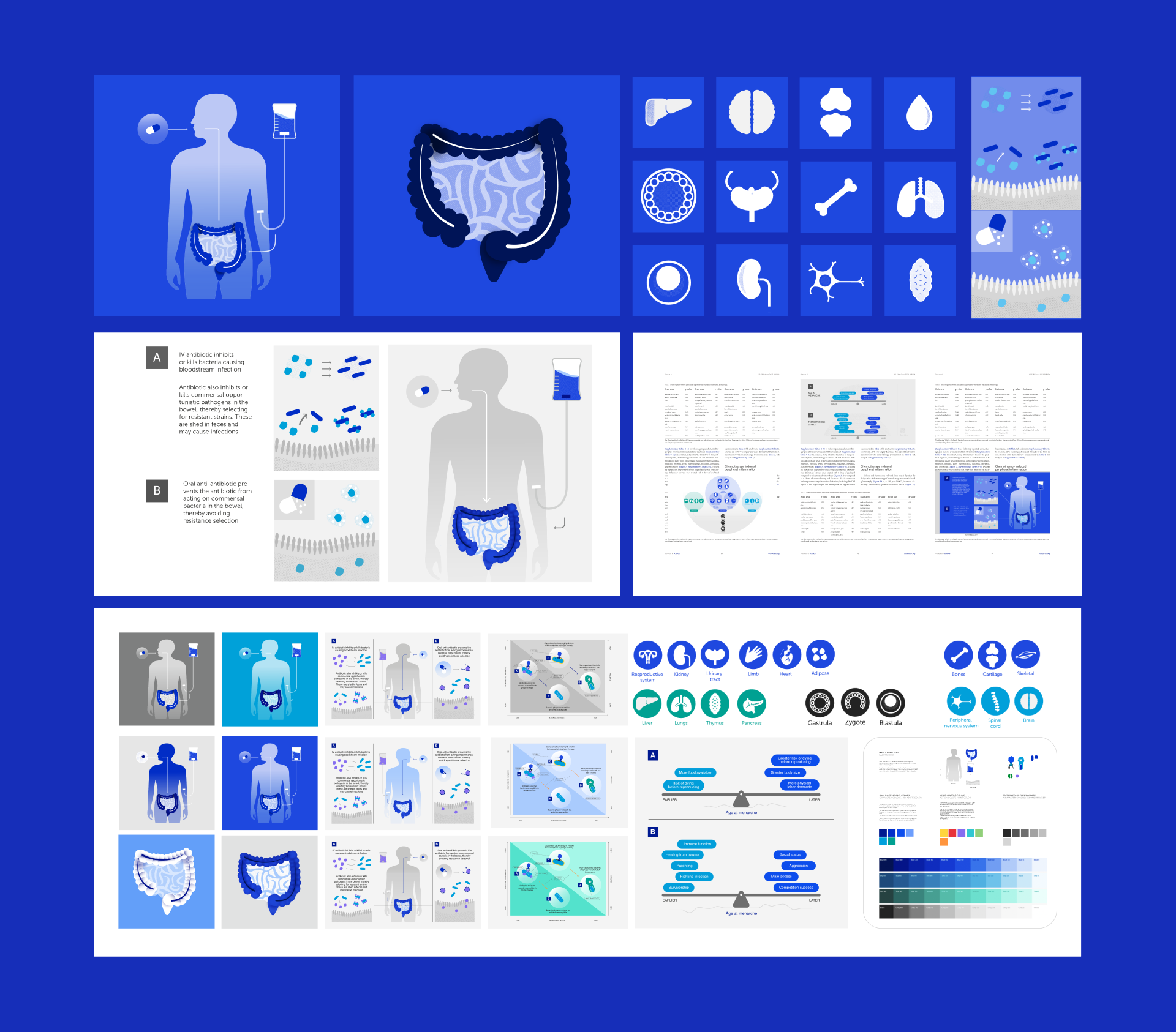
Scientific Illustrations
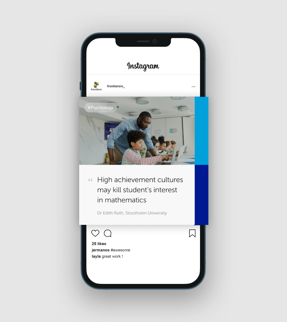
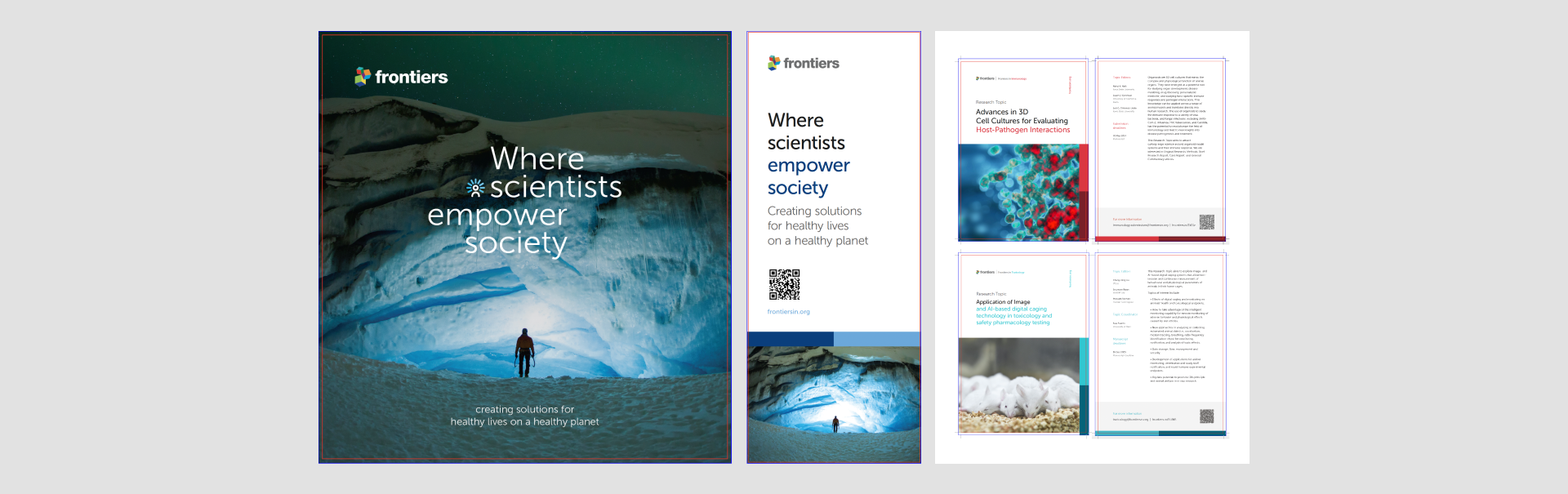
I worked on exploring and presenting an illustration system for the scientific figures featured in Frontiers in Science. This section promotes specific science papers and aims for a more impactful visual presentation to stand out from other journals. I highlighted the scientific aspects while incorporating rounded shapes to enhance a more humanistic approach, aligning with the brand's pillars. I also conducted a colour exploration, applying consistent gradient treatments to align with relevant information in the figures.
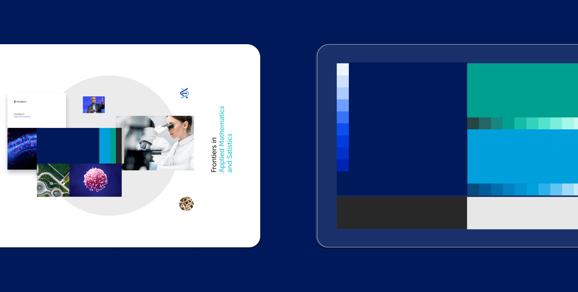
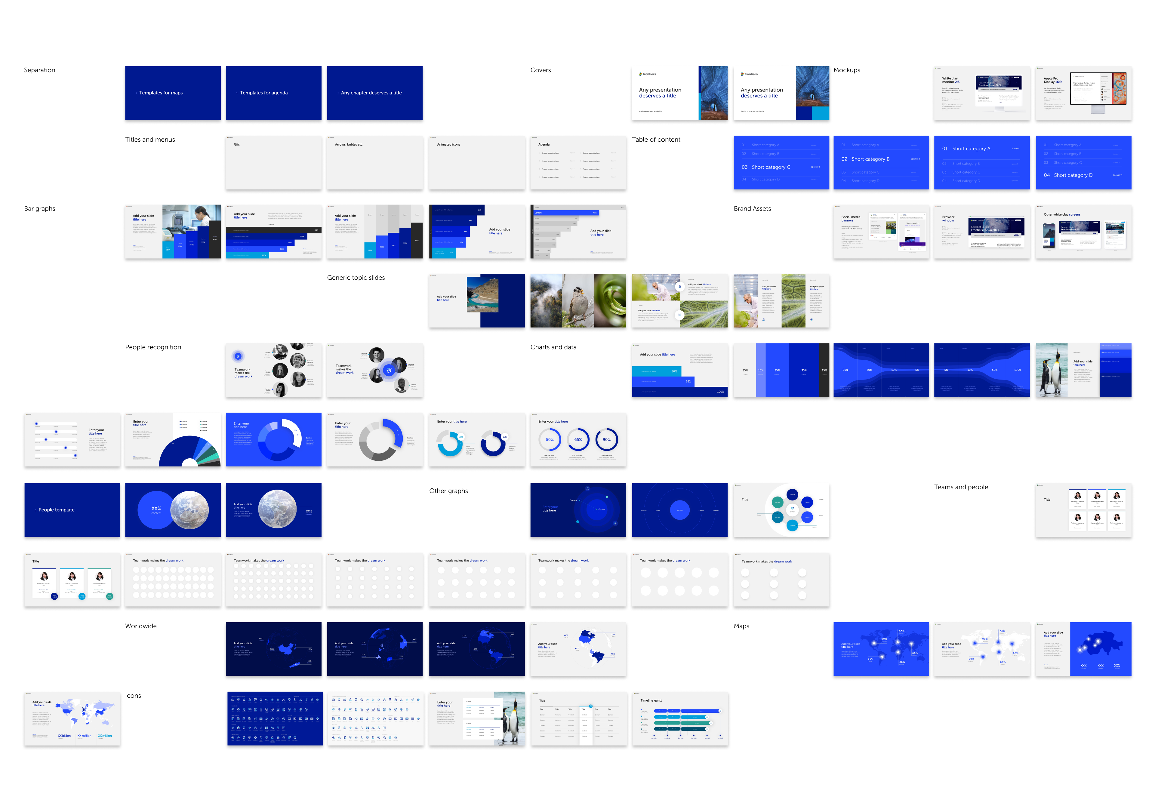
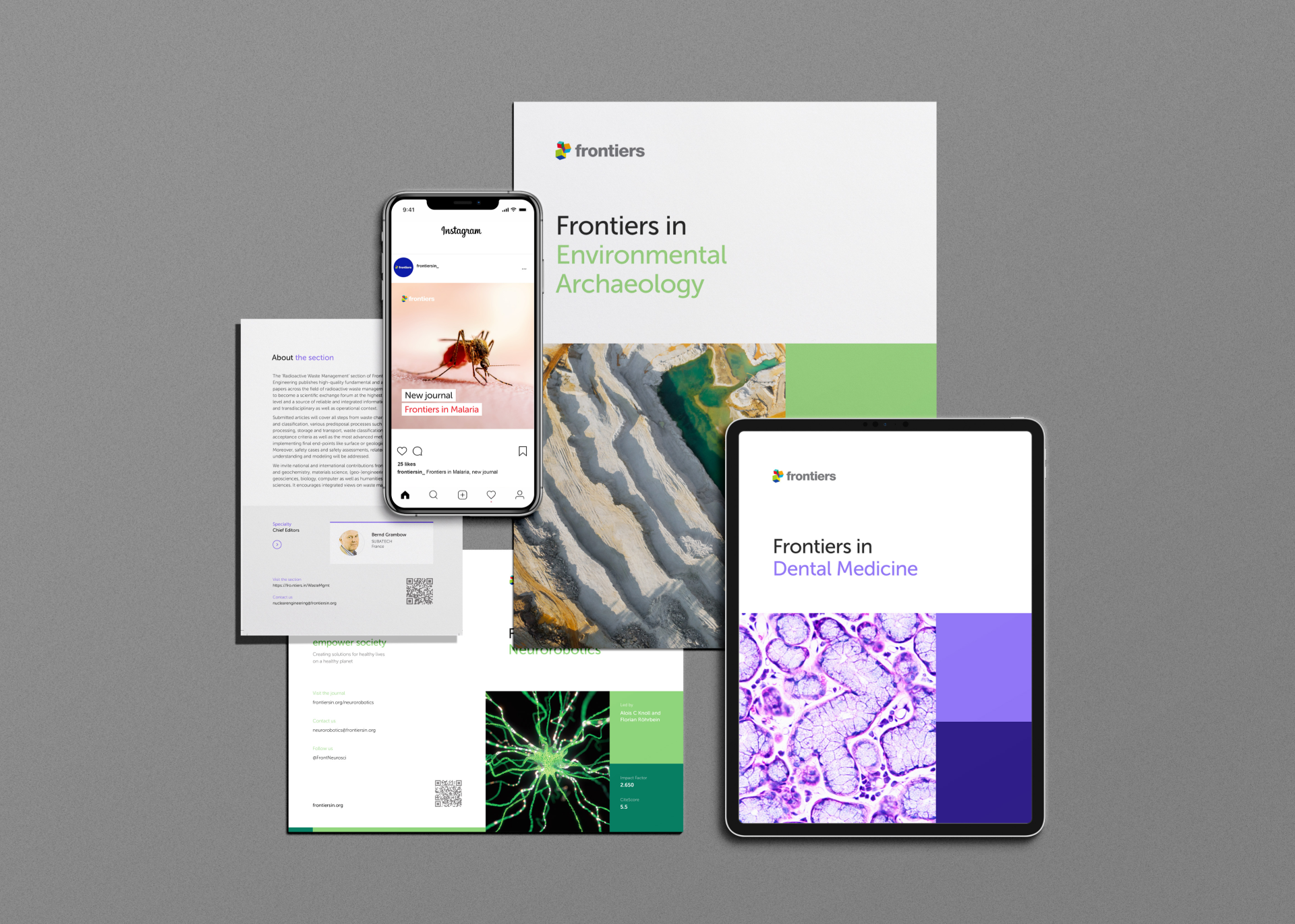
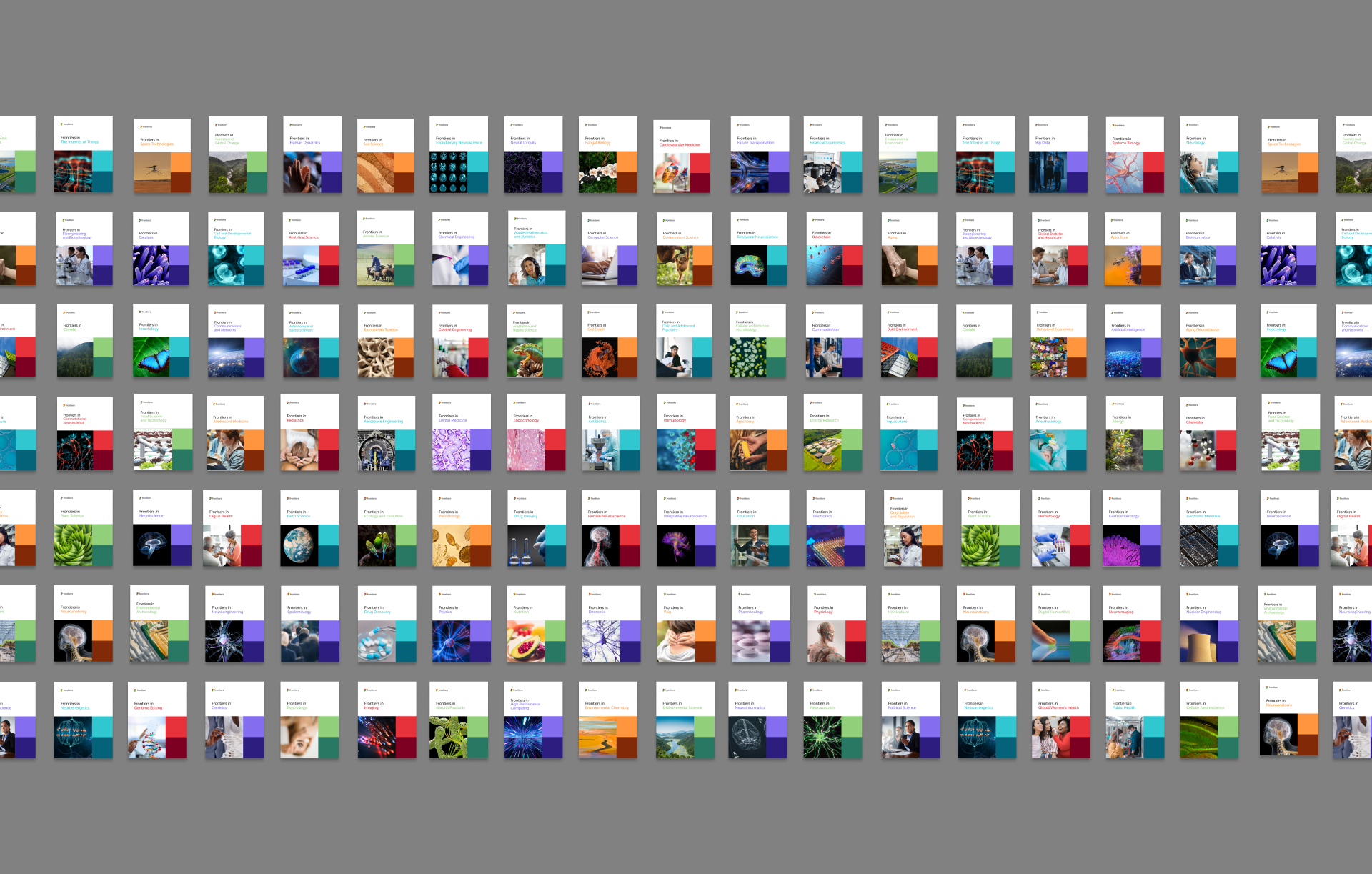
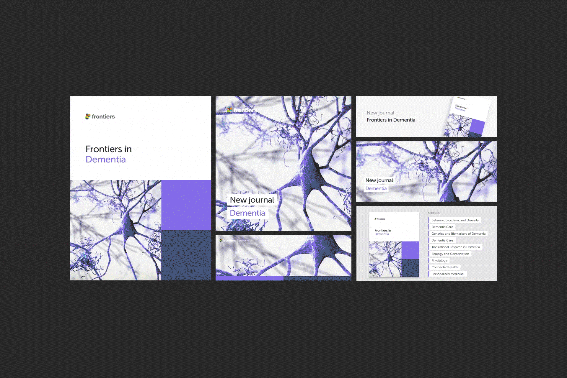
Frontiers Journal standardisation
After defining the main image and colour scheme for each journal, I focused on standardising the brand and creating launch packs for each journal. Each launch pack included a cover, Google ad, Twitter banner, Twitter header, and promotional submission banner. These assets were named according to the respective naming conventions and uploaded to the brand library for internal use.

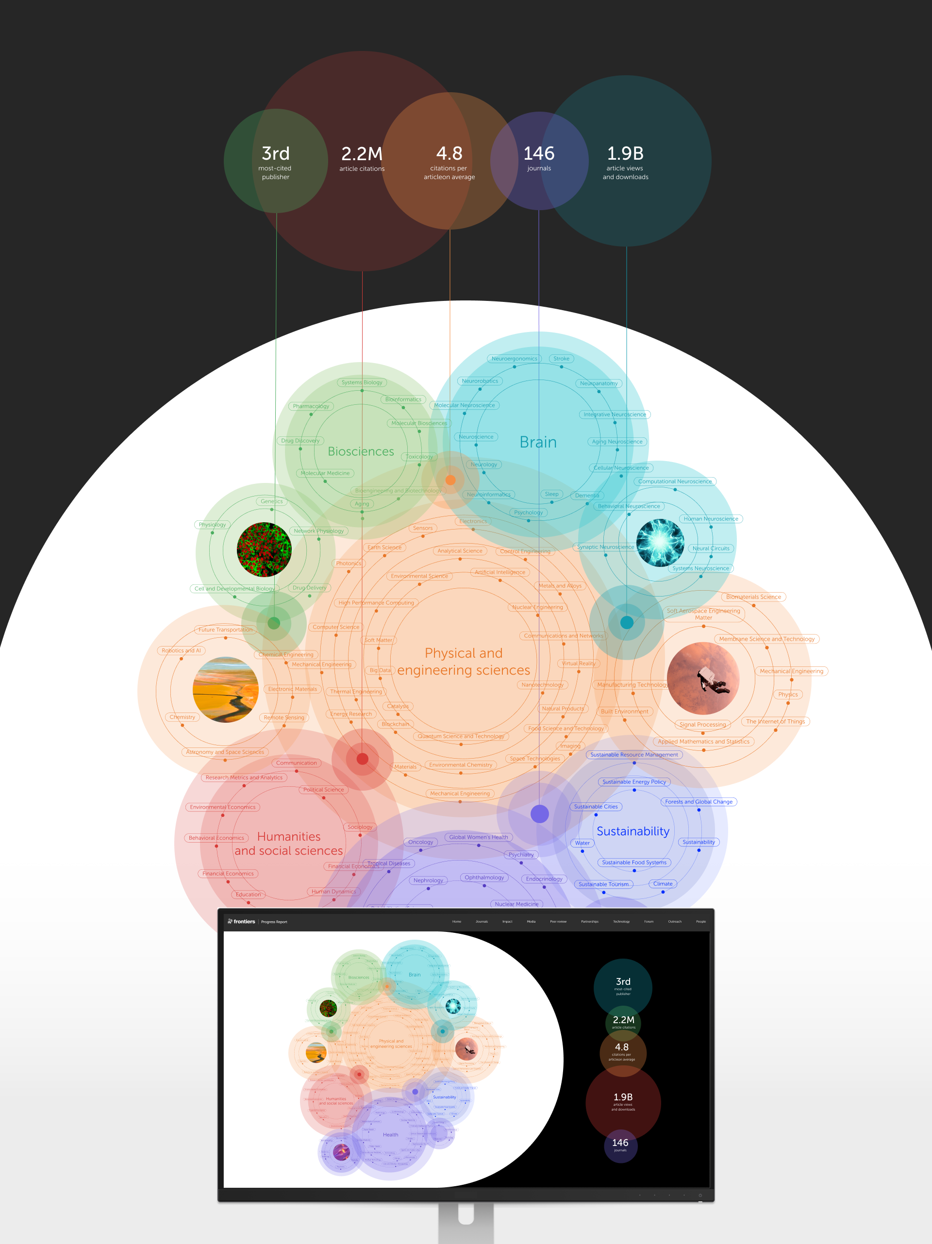
Data and information visualisation
Working on the scientific illustration, branding exploration, and presentation teams required different skills. Sometimes, a more technical and manual layout was needed, while other times, an eye-catching and impactful design was necessary. This experience allowed me to develop an appreciation for data visualisation. By incorporating data as images, I balanced the reliance on images as the main visual impact, preventing repetition and enhancing the use of numbers and data in a more appealing way.
Overview